Monday, March 21, 2011

Sounds into Art

First, listen to this: http://www.youtube.com/watch?v=NVk4vENObiI

Then, look at this: 

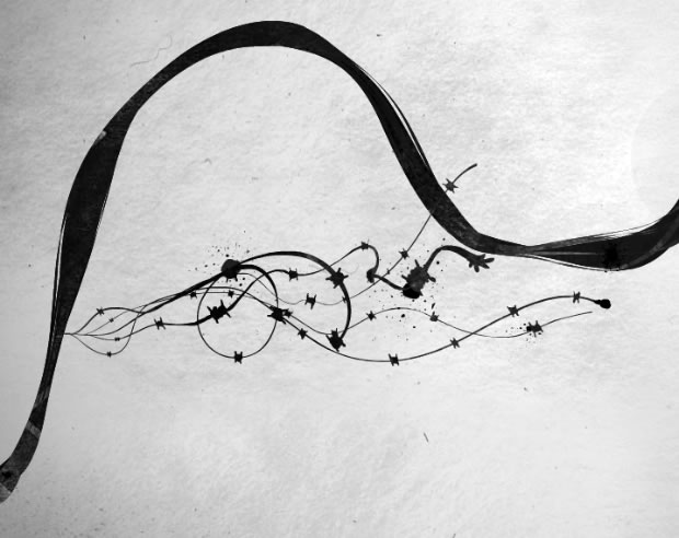
To me, this image looks like the opening few lines of this song along with the melody that runs through out. The thin small lines that explode from the larger line represent the voices of Enrique and Nicole at the very beginning. There aren't only two lines because their vocals seem to reverberate and echo slightly. The tiny jagged shapes that run along those smaller lines remind me of the heartbeat and short piano pieces that come sporadically. The large fluid movement of the longer line is similar to the flow and essence of the song.


Tight and Loose

Grids: Tight
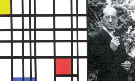
I found the Dutch artist Piet Mondrain's grid piece and kind of fell in love. I LOVE the use of the harsh black lines. The bright primary color boxes add a punch to the piece that it otherwise would not have.


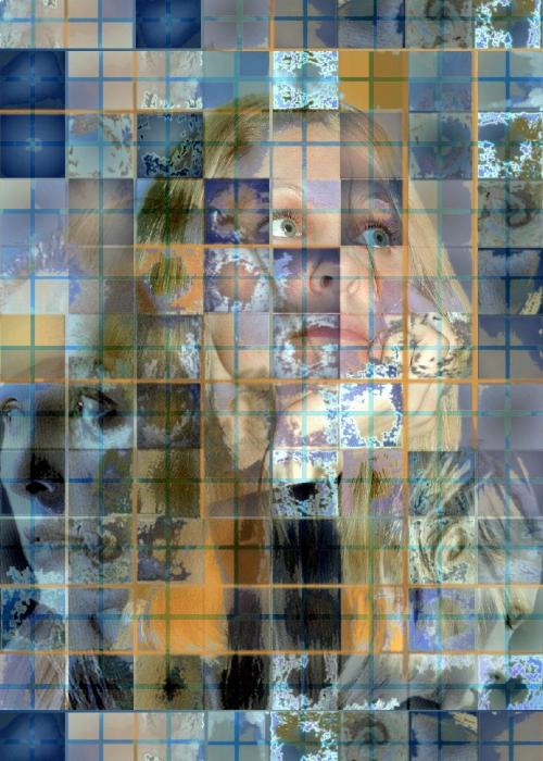
After much debate, I decided to post another tight grid image. This photo is really interesting due to the smaller images creating the whole. At first I only saw the center face and then after a few minutes of study I realized that there are two others in either corner. I like the different luminosity levels that were used in each square.


Loose:
For my loose structured grid I found this mixed media image. The monochromatic green grid in the background adds some stability and keeps this art grounded. The way the snowflake like images are so defined also adds a sense of structure that is needed in a grid.

المال, деньги, χρήματος, MONEY!

Who doesn't like money?! Our assignment in art this week is to either create an image that resembles a sound/song OR create our own money! I have decided on doing the sound one, but we were asked to post some interesting looking money. So, I have been surfing around for a while now, looking at Euros and Colones and many others. My favorite by far though is this...


This is a South African bill. I find the colors very interesting and the choice of the leopard is a very bold move. This money looks powerful. It is not as complex as some of the other types of currency, but the intricacy of the matrix in the back is boggling and over lay of the images is great! The words stand out on the page without being over bearing. Overall this bill is beautiful.

Sunday, February 27, 2011

Chuck Close


Can I just say wow? Chuck Close's art is very impressive! I love his first self portrait the best I believe. Its almost like a blown up photograph. I think his expression is priceless too. It seemed to capture his true character, a side that everyone sees, but also a side that only he sees.

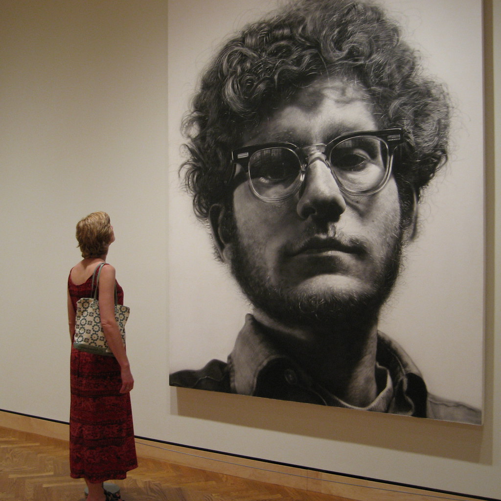
For this assignment though, I chose this image, Frank by Close.
Not only do I love the photographer's point of view, but I think this face in particular is captivating. His expression looks relaxed and yet semi concerned. I think Close's technique is very... different... in many of his other pieces, but for some reason I really enjoy this style of work. It looks like he is standing right in front of you...only HUGE!

Something else that I find to be super attractive about Close's work, is the fact that it is so LARGE! I feel as though it is an even greater achievement that Close can make his pieces look phenomenal on such a grand scale.

Wednesday, February 16, 2011

Andy Goldsworthy Art

The first piece of Goldsworthy art that I was introduced to was in my art book. The piece wa  the large rock balancing on top of the smaller pointed one. To me, this piece was intriguing. How in the world was he able to balance it so well on the tiny point? In theory, the larger rock could be a lot smaller than it looks in the photo, so in reality their weights might not be as massive as it appears...

In class, we were asked to look at some more of Goldsworthy's art and chose one that is permanent and write a little something about it. I could not chose just one... like usual.  The thing that caught my attention in these first two images were the curves in both pieces.


Being more of a logical thinker with an engineer's mind, the curves fascinate me! Goldsworthy does not use cement or any man made items in his art, and yet these curved shapes are able to hold together like champs! For me, the idea of how tightly he had to press the individual stones together is awe inspiring. I am constantly waiting for them to fall. While looking at the bridge over the wall, I've tried to imagine what would happen if it rains? Will the stones get slippery and begin to separate?


I enjoy this next Goldsworthy piece because of how the simplicity of the elements combined with the mind of Goldsworthy, this piece became a complex masterpiece. The overall project is a very neat piece, and the close up shot gives me more of an idea how all of the twigs are linked together.


Personally, I find Goldsworthy's art to be very intriguing and unique. The next entry will be where I create my own piece similar to his. Hopefully, /i will be able to create something just as interesting as his. 

Friday, February 11, 2011

My Own Gestalt


After the last post, I decided to create my own gestalt image. What do you know, that was an assignment as well. Just killed two birds with one stone. In my image I focused on the repetition of shapes and closure  because neither of the images are completely closed in. The water drop is my favorite, because of the colors. But the black and white polar bear turned out rather interesting.


Wednesday, February 9, 2011

Gestalt - Unity

Oh the many ways of unity. Today we were asked to find an image that represented one of the many different types of Gestalt's principles of unity.


This image represents the principle of similarity and emphasis. The black berries are all the same, creating an equal playing field, with everything being similar shapes and color, and then BAM! The red raspberry stands out against the black. Even though the raspberry is still the same shape as the black berries, because of the color difference has more of an impact. This red raspberry is an anomaly .