Grids: Tight
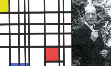
I found the Dutch artist Piet Mondrain's grid piece and kind of fell in love. I LOVE the use of the harsh black lines. The bright primary color boxes add a punch to the piece that it otherwise would not have.
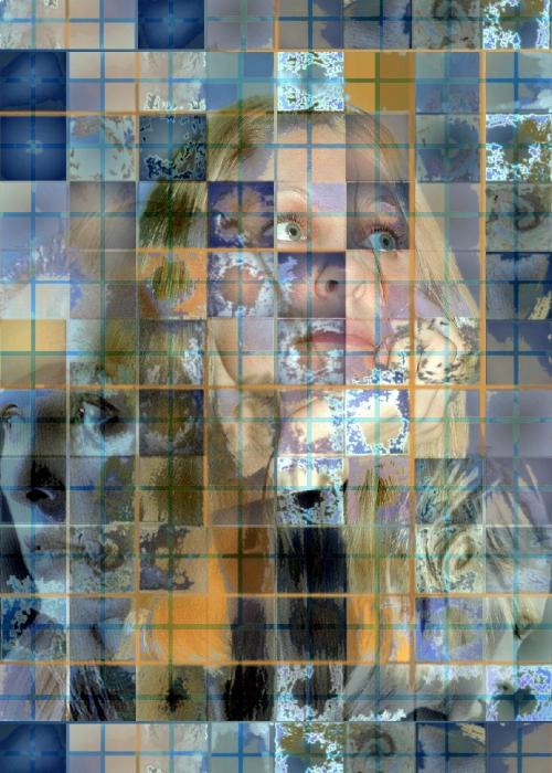
After much debate, I decided to post another tight grid image. This photo is really interesting due to the smaller images creating the whole. At first I only saw the center face and then after a few minutes of study I realized that there are two others in either corner. I like the different luminosity levels that were used in each square.
Loose:
For my loose structured grid I found this mixed media image. The monochromatic green grid in the background adds some stability and keeps this art grounded. The way the snowflake like images are so defined also adds a sense of structure that is needed in a grid.

No comments:
Post a Comment