Thursday, April 28, 2011

Implied Motion

Can I say any more? This post all have the theme of the Kentucky Derby and horses, and racing. I was inspired by my friends' Kentucky Derby mixer that was tonight. The big hats, the racing, the fun. Since this is implied motion blog, the best example is the running of the horses. So here goes...


Emphasis and Focal Points

All of my images are basically isolation...BUT each have multiple parts to them. I loved the contrast in this first image with the orange sky and the gray-green water underneath. It added so much interest to the image. The bright lightning in the back added such a tiny detail that jumps apart from the background so completely. The dark silhouettes against the colors create a sense of mystery in this picture.  

This swing picture looks amazing! This is something I would love to capture myself. The contrast between the swings and the bare sky creates the perfect outline. With this image being bare, the focal point of this picture is almost perfect. 


This image is similar to the one above. With this man being isolated from anything else, it creates a sense of loneliness. He looks distraught. His muscles, shadows, and hair contrast greatly with the blank background ensuring that he is the focal point. This photo creates such a stirring emotion.


Emotive Lines

I had to find a line that expressed emotion.So I created my own as well as used some existing lines that I found on the sidewalk. What better place? I feel like my lines express fun, creative, and a sense of playfulness. With the swirls leaving the staggering, jagged line in the cement seemed like the creative side of someone was leaving their logic behind.


Wednesday, April 27, 2011

BEAR Day!

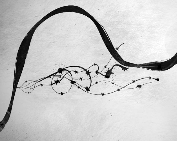
So a couple weeks ago (maybe 2 weeks ago) Mercer had its first ever Bear Day! Classes were cancelled (well, CLA classes were) and there was an Art show and students presenting research and it was very very to see. Of course I was only able to go to 2 different presentations, my friend's and the art show. But here are a few images I photographed while there:


This is a painting done by a young artist and received 3rd place.
I loved the difference the reflection in the glass created as I shot this.


This woman seemed to be at the right place at the right time while I was photographing. The pottery below received 1st place in the mixed media category and the paper tree placed 2nd.


The pottery was definitely fun and very interesting. The woman in the background seemed to match the art on the wall as well. She made me laugh as I was walking around 'creeping' on the art..


I liked how some of the photographs peered through the 'limbs' of the paper tree. It added an extra element to these images.


The overhead spot light was perfect on the little paper tree. It seemed to be a focal point on the floor and accentuated it in all the right ways.


Every time I tried to take this photo while looking into the glass gallery, this woman always stepped in my way. It was like she saw the camera and either thought I was being similar to a stalker or she just really loved the spot light. Luckily I was able to crop her out for this one.


This was the first place piece of art work for the photography category. It looked great and the frame made it look even better. The fact that it was black and white grabbed my attention above everything else. The photographer should be proud.


This young man won the painting section. Unfortunately, there was always someone in my way so I was unable to photograph his piece, but it looked great!


This is a friend of mine, Gary. He and I work together. His canvas won second! We were both pretty excited. It looked like the original box...only HUGE. Makes me hungry right now.


So that was the Bear Day art show. Hopefully next year there will be some more images. It should be exciting! 


-----Lines-----


This assignment is on Chapter 7: Lines. We were asked to find examples of lines and using our camera, take a picture and label them. So here is what I came up with.


I thought that the lines created by my pictures in my room were pretty cool. The white space that is not filled in by the photographs create  implied lines since they don't actually exist.


This is an image looking outside my window in my dorm. These lines created by my blinds are actual lines. When you turn them so the thin part is what faces you they create real lines across the background.

Monday, April 25, 2011

Dah... I can't breathe!

This post is not an assignment. I just needed a brief break from the real world, well the school world. I have a ton to do. Way too much to do and on top of it all, I am sick. Not like a cold sick. Not like I can function without feeling like crap sick. No. I'm the kind of sick that makes you want to curl in a ball and not see sunlight for a few days sick. My head feels like its in the clouds and I am of no benefit to society when I am in class. Sheesh. Why must we have attendance policies. Not necessary. 
So, yesterday felt like the worst day of my life. I know it wasn't. I have had much worse days, but waking up and not being able to breathe is a terrible feeling. Gasping while chewing your breakfast just so you can accomplish two of the most simple tasks of eating and breathing simultaneousnessly... Let's just say its a sight to see and will ruin your ear drums. Then on top of it blowing your nose until you look like Rudolph isn't all too pleasurable either. I'm hoping that it is only a sinus infection, but the loss of my voice worries me. I can barely talk (stop laughing Jas. It's not funny). I really wish I could just sleep. That is truly what I would like to do, but alas I must finish a group project, complete my editing for Red Team, add pages upon pages to my Comp. Site, and somehow find time to read for discussion in class, and eat.
Luckily, after a long pause before finishing this, I have completed my group project that is due tomorrow. Now I am on to my draft editing for Red Team. I have never been graded on my editing before. This should be interesting. Well, I guess it is time to finish this post so that I can get onto my editing then get some much needed rest. Good night world. I hope you are fairing better than me. 


Sunday, April 24, 2011

Faith Ringgold:


We were asked to find a work by Faith Ringgold and look at her use of color. I chose this piece piece.
I thought her use of the colors red, green, and black was interesting. The red seems to signify the danger that the people were in the middle of. The black of the people seemed to keep the individuals a mystery so that even the viewers do not know who they are. And the bold green seemed to bring a sense of renewal and new life that these mystery figures were about the enter.

Colors in Music


Since my color assignment was on the color red, I wanted to specifically find a music video that emphasizes the same color. After much searching, I found this...  http://www.youtube.com/watch?v=ZJL4UGSbeFg It is Shania Twain's 'Feel Like a Woman' music video. In this video, the background of the stage is a shade of red as well as her background  vocals. The color induced a kind of sexual appeal which corresponds well with the feeling of her song.

Monday, April 4, 2011

Money doesn't buy everything, but you can make almost anything from it

No, money wont buy happiness, but you can be s creative as you desire with money. 

When I was younger, probably early teens, my parents and I went to P.F. Chang's in Atlanta, Georgia on a road trip home from Florida. While we were enjoying a meal, our server asked if he could show me something. Being curious me, I said sure and sat patiently while he pulled out 3 one dollar bills from his pocket. Quickly and seamlessly, he folded the first dollar into a ring. Washington's face was even on the top. Then he folded the next two into a box with a pull out drawer. To complete this work of art, he placed the ring inside the box and handed it to me. I was thrilled! The thought of taking money and making it into something rather than spending it had never crossed my mind. To think, money can be used for so many more things than just buying happiness....

For this assignment, I was asked to look at a particular website that showed pictures of money-made objects, then to find other pieces that I liked and explain why. Here are two that I thought were pretty interesting:
Where did they even begin for this dress?! I would never have the patience to sew, glue, or tack together this many individual pieces. I like they this piece was created with so many different colored money. Oh the beauty of other countries' currency.

After a little more searching, I found this little guy. I LOVE him! HE by far, is my absolute favorite. All those tiny stripes are pieces of different bills. 

So now, go exploring and see what money can do for you...


A-R-T

My assignment was to create an image in Adobe Illustrator using the letters A, R, and T. They could not over lap and I had use the colors red, white, and black.

This is what I came up with:


Monday, March 21, 2011

Sounds into Art

First, listen to this: http://www.youtube.com/watch?v=NVk4vENObiI

Then, look at this: 

To me, this image looks like the opening few lines of this song along with the melody that runs through out. The thin small lines that explode from the larger line represent the voices of Enrique and Nicole at the very beginning. There aren't only two lines because their vocals seem to reverberate and echo slightly. The tiny jagged shapes that run along those smaller lines remind me of the heartbeat and short piano pieces that come sporadically. The large fluid movement of the longer line is similar to the flow and essence of the song.


Tight and Loose

Grids: Tight
I found the Dutch artist Piet Mondrain's grid piece and kind of fell in love. I LOVE the use of the harsh black lines. The bright primary color boxes add a punch to the piece that it otherwise would not have.


After much debate, I decided to post another tight grid image. This photo is really interesting due to the smaller images creating the whole. At first I only saw the center face and then after a few minutes of study I realized that there are two others in either corner. I like the different luminosity levels that were used in each square.


Loose:
For my loose structured grid I found this mixed media image. The monochromatic green grid in the background adds some stability and keeps this art grounded. The way the snowflake like images are so defined also adds a sense of structure that is needed in a grid.

المال, деньги, χρήματος, MONEY!

Who doesn't like money?! Our assignment in art this week is to either create an image that resembles a sound/song OR create our own money! I have decided on doing the sound one, but we were asked to post some interesting looking money. So, I have been surfing around for a while now, looking at Euros and Colones and many others. My favorite by far though is this...


This is a South African bill. I find the colors very interesting and the choice of the leopard is a very bold move. This money looks powerful. It is not as complex as some of the other types of currency, but the intricacy of the matrix in the back is boggling and over lay of the images is great! The words stand out on the page without being over bearing. Overall this bill is beautiful.

Sunday, February 27, 2011

Chuck Close


Can I just say wow? Chuck Close's art is very impressive! I love his first self portrait the best I believe. Its almost like a blown up photograph. I think his expression is priceless too. It seemed to capture his true character, a side that everyone sees, but also a side that only he sees.

For this assignment though, I chose this image, Frank by Close.
Not only do I love the photographer's point of view, but I think this face in particular is captivating. His expression looks relaxed and yet semi concerned. I think Close's technique is very... different... in many of his other pieces, but for some reason I really enjoy this style of work. It looks like he is standing right in front of you...only HUGE!

Something else that I find to be super attractive about Close's work, is the fact that it is so LARGE! I feel as though it is an even greater achievement that Close can make his pieces look phenomenal on such a grand scale.

Wednesday, February 16, 2011

Andy Goldsworthy Art

The first piece of Goldsworthy art that I was introduced to was in my art book. The piece wa  the large rock balancing on top of the smaller pointed one. To me, this piece was intriguing. How in the world was he able to balance it so well on the tiny point? In theory, the larger rock could be a lot smaller than it looks in the photo, so in reality their weights might not be as massive as it appears...

In class, we were asked to look at some more of Goldsworthy's art and chose one that is permanent and write a little something about it. I could not chose just one... like usual.  The thing that caught my attention in these first two images were the curves in both pieces.


Being more of a logical thinker with an engineer's mind, the curves fascinate me! Goldsworthy does not use cement or any man made items in his art, and yet these curved shapes are able to hold together like champs! For me, the idea of how tightly he had to press the individual stones together is awe inspiring. I am constantly waiting for them to fall. While looking at the bridge over the wall, I've tried to imagine what would happen if it rains? Will the stones get slippery and begin to separate?


I enjoy this next Goldsworthy piece because of how the simplicity of the elements combined with the mind of Goldsworthy, this piece became a complex masterpiece. The overall project is a very neat piece, and the close up shot gives me more of an idea how all of the twigs are linked together.


Personally, I find Goldsworthy's art to be very intriguing and unique. The next entry will be where I create my own piece similar to his. Hopefully, /i will be able to create something just as interesting as his. 


Friday, February 11, 2011

My Own Gestalt


After the last post, I decided to create my own gestalt image. What do you know, that was an assignment as well. Just killed two birds with one stone. In my image I focused on the repetition of shapes and closure  because neither of the images are completely closed in. The water drop is my favorite, because of the colors. But the black and white polar bear turned out rather interesting.


Wednesday, February 9, 2011

Gestalt - Unity

Oh the many ways of unity. Today we were asked to find an image that represented one of the many different types of Gestalt's principles of unity.


This image represents the principle of similarity and emphasis. The black berries are all the same, creating an equal playing field, with everything being similar shapes and color, and then BAM! The red raspberry stands out against the black. Even though the raspberry is still the same shape as the black berries, because of the color difference has more of an impact. This red raspberry is an anomaly


Friday, February 4, 2011

Facial Hair....What?!


I have thing for mustaches. No, I don't like it when guys have thick, over grown, facial hair, and I don't really like it when they have a mustache at all actually. But for some reason I am drawn to the various shapes of mustaches. There are so many different shapes and each one gives a unique look into someone's personality. Lately, they seem to be a new trend in fashion and accessories, maybe not on anyone's face, but on everything else.


Maybe its because I am a girl, and facial hair is not really an option....well, I guess I could, BUT that's NOT happening! Maybe its because when I was little my dad had one. I really don't know, but there are so many cool things you can get with these hairy little guys taking the main stage.


And yes, I will admit, I am the girl that will draw the stache on my finger and hold it under my nose. But! mine cooler than most because when I have my mustache, I wiggle my finger back and forth. Call me lame, I don't mind, but that is my interpretation of mustaches.


So kudos to you with facial hair! Keep inspiring people! But keep it trimmed please. Un-kept staches are the worst.

Louise Nevelson Boxes


Boxes, boxes, and more boxes. This time I have been looking at Louise Nevelson's boxes. In Nevelson's pieces she keeps a uniform color, usually one shade, white or black, and minimizes the amount of shapes inside her box. In both images my favorite thing is how all of her shapes are simple. Many of these objects appear to be similar to house hold items or things that are easily found lying around, then painted white and stacked together.


There are so many objects inside of her boxes, and since they are all the same color, it takes a moment to define exactly what you are looking at, causing the audience to gaze longer. The way the shadows are formed from the surrounding lights help create a rich depth in her work. The simplicity makes these pieces incredibly intricate


Lucas Samaras Box

The latest assignment was to choose a Lucas Samaras box that we liked and explain what we think is interesting. After going through a lot of his work, I found these two boxes. 


In the first image, I really like the bird that is perched don top. The stripes look very rustic and compliment the mossy like grass nicely. The addition of the grass going all over the side with the bird makes this box appear as if that is the natural half.


I chose this second box because I like the media he decided to use on this box.  The jagged edges hanging out of the bottom of the box add some mystery and danger. I also like the mirrored material he chose for the top of the box. The textured outside adds an additional element of interest to this piece as well.